
Using AutoML Thinking to Build Smarter SharePoint Dashboards with Copilot

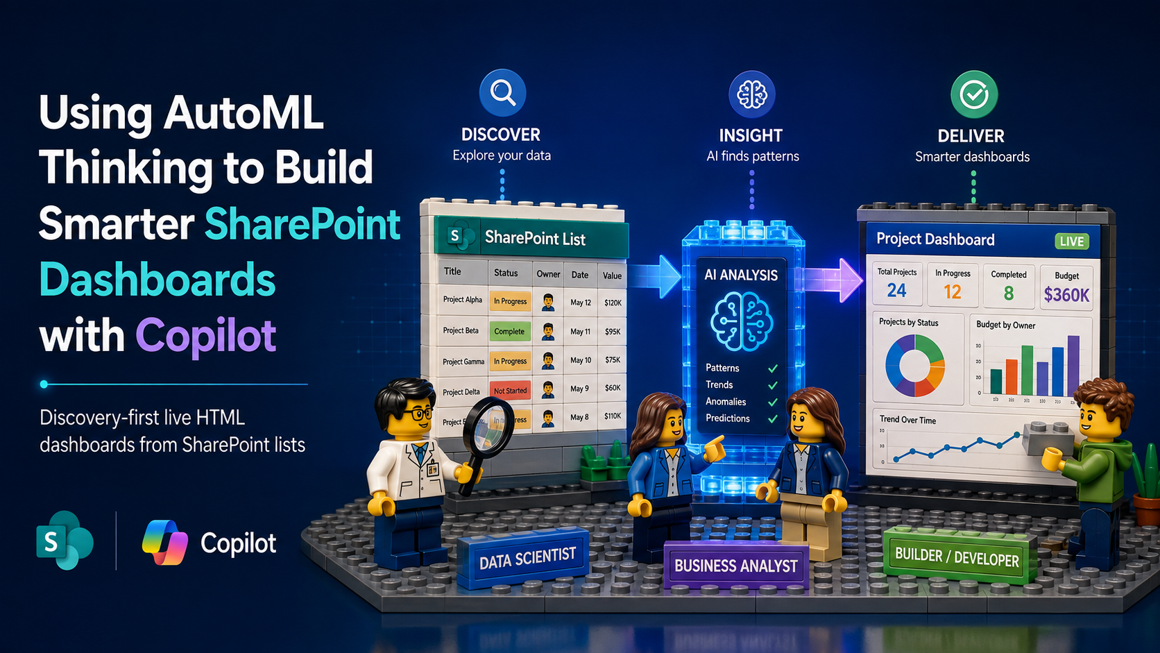
Copilot’s ability to create live-linked HTML dashboards from SharePoint lists is impressive. But what happens if we borrow a page from AutoML and let Copilot analyze the list before deciding what the dashboard should show?
It does exactly what you’d hope. It effectively puts on several different hats and works through the problem from three perspectives:
Data Scientist Role
- Understands the list structure
- Analyzes the underlying data
- Examines potential measures, dimensions, and combinations of fields
- Looks for patterns, trends, outliers, and relationships in the data
Business Analyst Role
- Identifies KPIs that can support better decision-making
- Prioritizes the most meaningful measures
- Determines what additional context leaders need to interpret the data
- Selects the visualizations that best communicate what it finds
Web Developer Role
- Builds a visually rich, interactive dashboard
- Connects it directly to the live SharePoint list data
The result is more than a prettier way to visualize a list. Instead of deciding in advance what the dashboard should tell us, we can let Copilot help discover what the data is telling us first.
Check out the video below
The Prompt
***********************************
I want to create an interactive, live-linked HTML dashboard for this SharePoint list and save it in the Site Assets library.
Before designing the dashboard, analyze the structure and contents of the list to determine what information would be most useful to leadership.
Review the available columns and the relationships between them. Look for meaningful trends, patterns, concentrations, outliers, changes over time, and relationships between fields that could help leadership better understand performance, identify risks or opportunities, and make better decisions.
Do not simply visualize every available column. Identify the measures, dimensions, and combinations of fields that provide the most meaningful insight. Where appropriate, derive useful metrics from the existing data, such as percentages, averages, aging, variance, rates, or other calculated indicators.
Use that analysis to determine:
the most important KPIs or summary measures to highlight;
which columns should be compared or grouped together;
which trends over time are worth showing;
which unusual values or exceptions leadership should be able to spot quickly;
which visualizations best communicate each insight.
Then create a polished, executive-friendly HTML dashboard that remains live-linked to the SharePoint list so that it reflects the current data whenever it is opened.
Prioritize clarity and decision-making over the number of charts. Include concise labels and context so that a leader can quickly understand what each visualization is showing and why it matters.
Save the resulting HTML dashboard in the Site Assets library. Check for any javascript errors.
***********************************